
Design | Corporate Identity | Fish & Field
Today is the launch of Fish & Field Biokineticists‘ new branding; complete with logo, business cards, letterhead, e-mail signature and website created by the team at Natalie Field Photography!
Fish & Field brand launch with Corporate Identity Design from Natalie Field Photography!
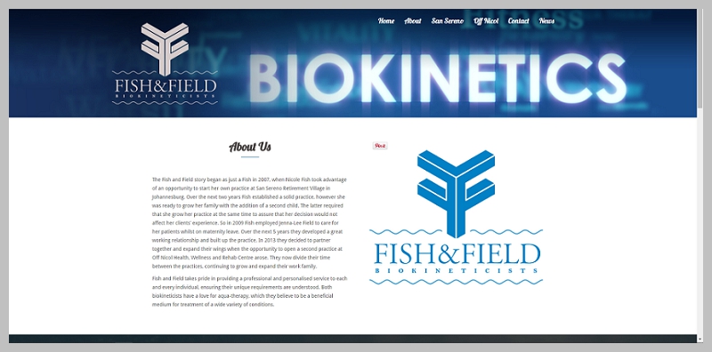
We worked closely with Nicole Fish and Jenna-Lee Field to create a brand in line with their field: health and fitness. Fish & Field offers both land-based biokinetic- and aqua-therapy, and it made sense to translate these services into wordplay around their surnames of Fish & Field. The logo illustrates the two F’s back-to-back, creating a tree symbolizing the land-based therapy (Field), with the font encapsulated by water to refer to the aqua-therapy (Fish). This combination also creates a balance indicative of the full body experience the patient receives when treated with both techniques. Naturally we worked with water and earth tones to emphasize the concept.
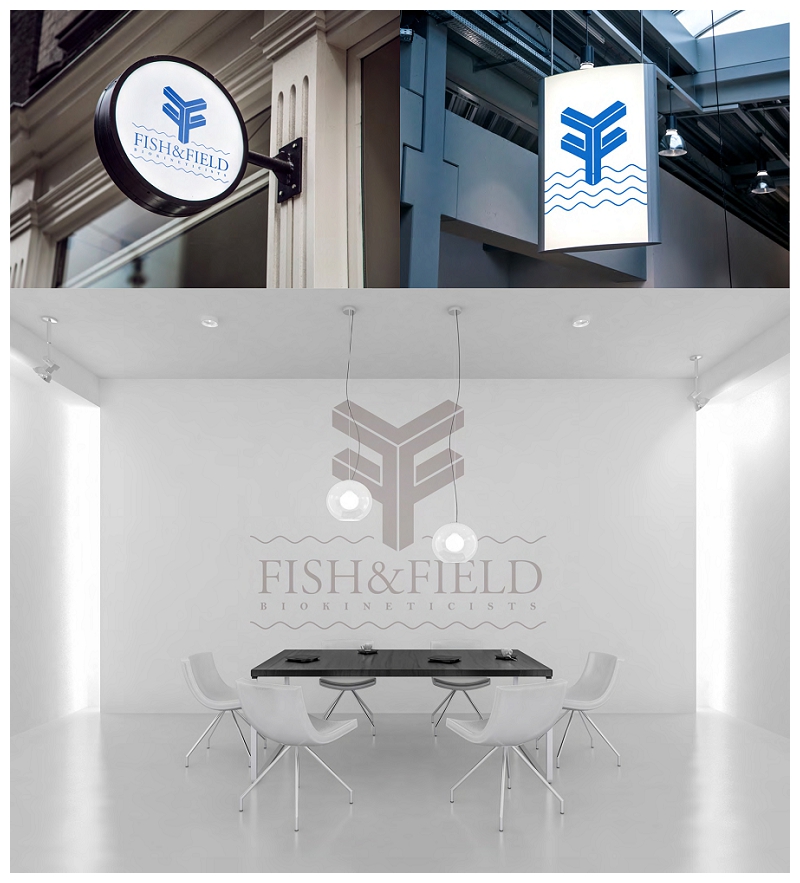
The logo has been applied to various marketing tools, including business cards, letterheads and email signatures. Elements of the water have been re-appropriated to pull the theme through on the various applications. We also provided proof of concept to show how the logo could be applied to signage.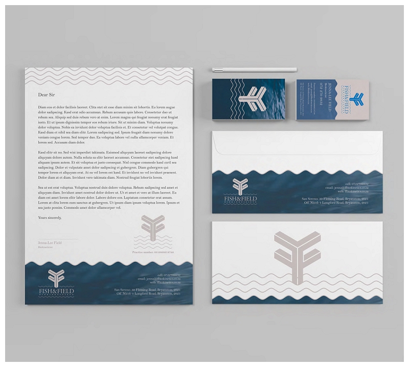
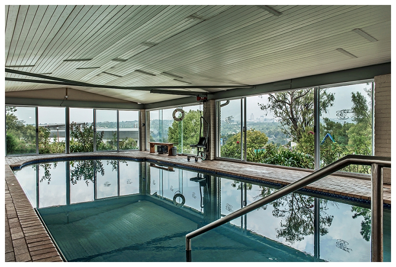
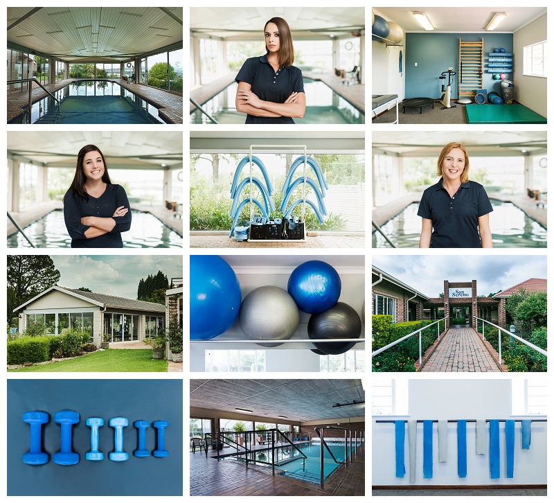
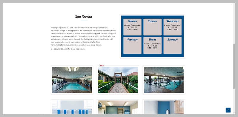
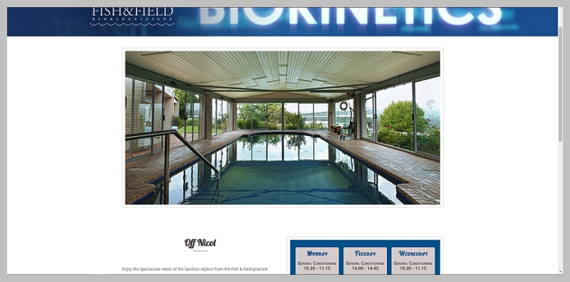
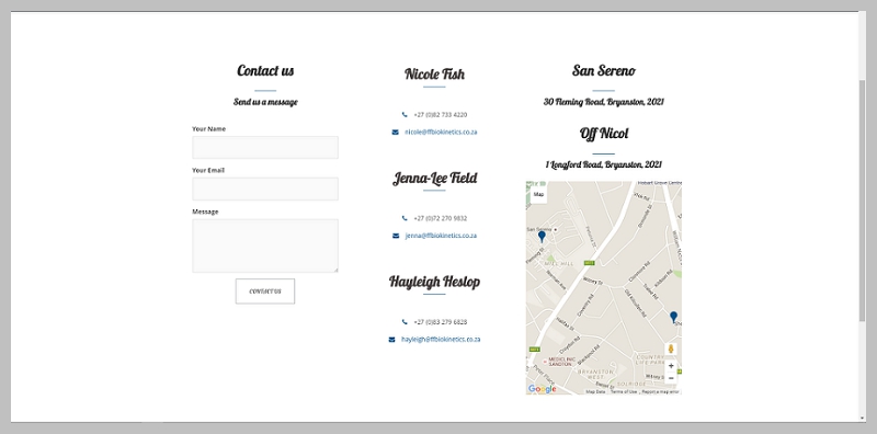
 I spent time at their premises at San Sereno and Off Nicol respectively to capture images of the facilities, equipment and team for the website and marketing materials.
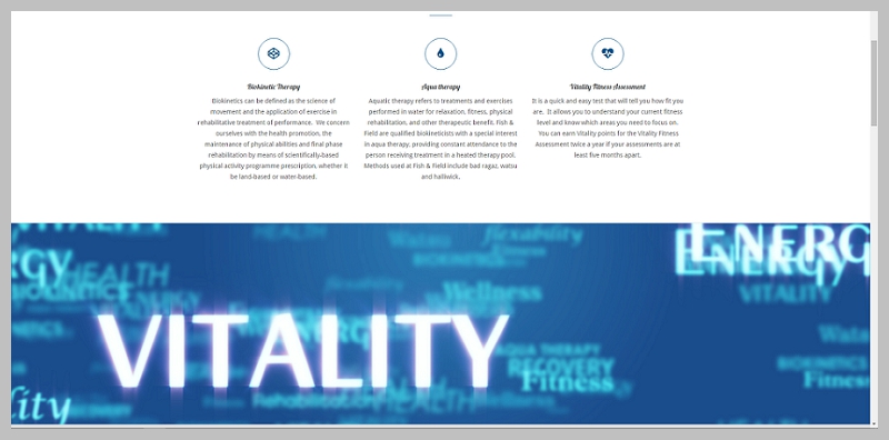
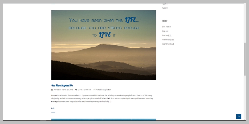
Finally it all came together during the web developement stage, below a few excerpts from the pages. To see more you can visit the site at Fish & Field !
Credits
Photography & Retouching | Natalie Field
Graphic Design | Matthew Harvey
Web Developement | Natalie Field
For an all encompassing experience have your brand developed by Natalie Field Photography. Contact Us.


